What do you think of when you hear… Toms Shoes?
Or Chipotle?
What about Kodak?
Did anything negative come to mind? How do you feel when you think of those companies?
What we perceive about a particular product or service is ultimately what shapes our buying behaviors. With such a wide assortment of products and different brands available, brand equity is much harder to achieve. This means that now more than ever, an effective brand strategy is crucial in order for a company to achieve a sustainable competitive advantage.
The Foundation of a Brand
Logos are much more than just symbols or images. They have the ability to communicate lots of information about a brand, such as the industry its in, social responsibility and company values. Some logos say so much about the brand and are easily recognizable that the company name isn’t even necessary. As a company evolves, its logo must move with the changing times as well, since they should accurately represent the company.
Here are some of my favorite examples of logos that have changed over time:
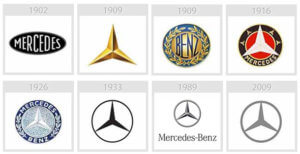
Mercedes-Benz
Many people are familiar with the three-pointed star, symbolizing land, sea, and air, that represents the luxury car brand. However, the beautiful symbol was not developed until 1909, 23 years after the first Benz automobile was created. So, what was the original logo?

Nike
The Nike Swoosh embodies elements of movement and simplicity. The iconic trademark makes Nike the most valuable brand in the athletic apparel industry, with it valued at $15.9 billion. The Swoosh first appeared on a sneaker in 1972, but it looked a little different, as it featured the brand name. Today, the Nike brand is so strong that it is easily recognizable by the Swoosh alone.

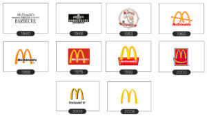
McDonald’s
When the famous fast-food chain was founded in 1940, it offered a different type of cuisine than we know McDonald’s to offer today: barbecue. About ten years later, since profits seemed to be coming just from hamburgers, they revamped the menu to feature burgers, fries, and milkshakes. The company has changed so much ever since, opening stores internationally and adding features like drive-thrus, poultry items, coffee beverages, breakfast, and much more. With all of these major company changes, of course, the logo had to change, too.

It is both interesting and surprising to see how different these popular logos used to look years ago. The strategy behind rebranding and developing these logos strongly depends on the element of creativity.
Branding revolves around the art and creative science behind marketing, which will be discussed more in depth by Lia Reich next Tuesday, February 27th at 6pm. If you have not done so yet, please RSVP to our next event on meetup. Thanks for reading and we hope to see you next week!
Sources:
https://www.logodesignlove.com/mercedes-benz-logo-evolution
https://99designs.com/blog/tips/what-is-a-logo/
http://www.marevueweb.com/Images-Post/evolution-logos/mercedes-evolution.jpg
https://www.forbes.com/pictures/mlm45eflmk/1-nike-2/#168845c86803
http://1000logos.net/wp-content/uploads/2017/03/Nike-Logo-history.jpg
https://www.mcdonalds.com/us/en-us/about-us/our-history.html
http://logos.wikia.com/wiki/McDonald%27s
http://1000logos.net/wp-content/uploads/2017/03/McDonalds-Logo-history.jpg
